Why AI Interfaces Keep Looking the Same
AI-generated interfaces often converge on the same cards, gradients and dashboard layouts because the request does not contain enough product meaning to pull them apart. The distinctive-interface-design skill changes the design question from ‘make it modern’ to ‘what should this product help people recognize and do?’
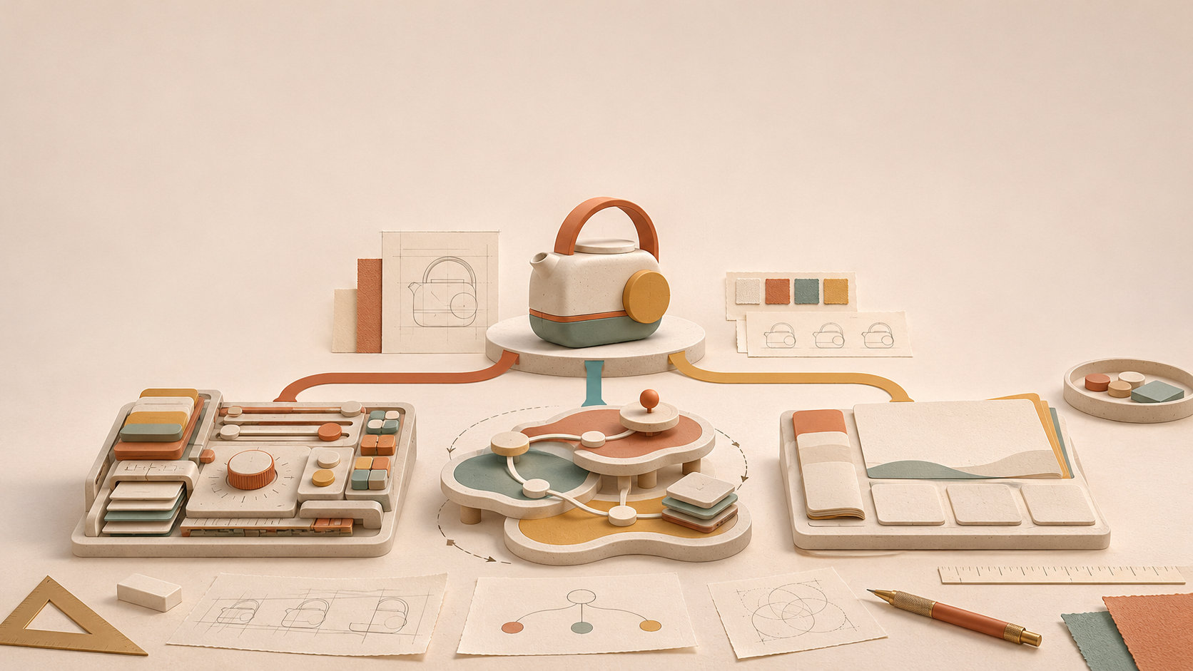
Ask an AI model for a “beautiful modern dashboard” and it will usually give you something convincing: rounded cards, a large heading, a soft gradient, a sidebar and a few carefully spaced charts.
The result can be clean and still feel interchangeable. Change the company name and the same screen could belong to a finance tool, a project tracker or an internal admin panel.
That convergence is the problem behind the distinctive-interface-design skill in the Prompt Library. The skill is not another list of colors, fonts or component recipes. It changes the evidence an agent has to work from, the alternatives it has to consider, and the checks it has to pass before a visual direction earns its place.
1. The model is answering an underspecified question
“Make it premium” describes a mood, not a product. “Use a modern layout” says almost nothing about the user's decision, the important objects or the states that need to be understood.
When the request is vague, the model reaches for patterns that have worked across many examples. A card grid is a safe way to group information. A sidebar is a safe way to expose navigation. A blue or purple gradient signals “software” without requiring the model to know what the software means.
Those choices are not always wrong. They become a problem when they are selected before the product has had a chance to influence the interface. The visual language arrives first, and the actual content is fitted into it afterward.
The same thing happens when the evaluation is only a screenshot. A screenshot rewards immediate polish: tidy spacing, obvious hierarchy and familiar controls. It does not reveal whether a suspended account is distinguishable without color, whether a long member name breaks the layout, or whether the primary task is slower on a phone.
2. AI design converges for understandable reasons
Several pressures push generated interfaces toward the same center:
- Shared examples create shared priors. Models have learned a large collection of successful interface patterns. Those patterns are useful starting points, but they are also the easiest answer to a generic request.
- Adjectives hide decisions. “Minimal,” “bold” and “premium” do not say which object deserves attention, what belongs above the fold, or how a failure state should be recognized.
- The first concept becomes the template. Once a plausible layout exists, later revisions usually change its colors and spacing instead of questioning its information architecture.
- The feedback loop favors the hero frame. A polished first viewport can hide awkward flows, inaccessible states and content that does not scale.
None of these pressures means an AI model cannot produce a specific interface. They mean specificity has to be supplied and tested. Without that pressure, the most statistically familiar answer wins.
3. The skill changes what “good” has to explain
The distinctive-interface-design skill begins with the product's users, context, expertise, constraints, job, domain objects and meaningful states. That information gives the interface something concrete to express.
Imagine a hypothetical team settings screen. An administrator needs to review members, change one permission and understand who will be affected. Members can be active, suspended or waiting to accept an invitation. Long names, keyboard access, zoom and an audit trail matter.
That product has a different visual problem from a marketing landing page. Its first viewport should make responsibility and state legible. A decorative greeting or a giant hero would compete with the roster the administrator came to inspect.
The skill then asks for a visual thesis with a product reason behind it. “Permission changes should read like a visible control room for responsibility” can guide hierarchy, state language, emphasis and feedback. It explains why the interface should look and behave this way. “Make it premium” cannot.
The full source contains the workflow for producing that brief and thesis. The article's point is why those inputs matter: they give the model constraints that generic visual vocabulary leaves out.
4. Distinctiveness requires alternatives that disagree
A single generated concept is easy to mistake for a solution. The skill requires several concepts that differ in structure, information architecture, density, typography or interaction model.
For the settings screen, one concept might keep a dense roster in view. Another might make invitation and suspension a visible state map. A third might turn the work into a one-member-at-a-time review queue. These concepts disagree about how the administrator thinks about the task; they are not the same dashboard in three accent colors.
That disagreement exposes tradeoffs. The state map may explain lifecycle changes well but make a one-person edit slower. The review queue may suit a weekly audit but hide the full roster. The dense roster may preserve the daily task while borrowing clearer state language from the map.
This is why the skill includes a deliberate comparison and an anti-fixation check. The selected concept should win because it fits the product and its constraints, not because it looked most impressive in the first render. If it still resembles the first default in structure, the process has not created real alternatives.
5. A rendered interface reveals what the concept hid
Design decisions that look persuasive in a static frame often fail in the states people actually use. A label wraps into a button. A pending state is invisible to a screen reader. A mobile layout turns the primary action into a scrolling scavenger hunt. A focus ring disappears against the chosen accent.
The skill treats rendered inspection as evidence. It asks the agent to look at desktop and mobile sizes, long content, loading, empty, error, focus, pressed, disabled and validation states. It keeps UX, accessibility, distinctiveness and implementation critiques separate so a striking visual treatment cannot excuse a broken task or an inaccessible control.
That is a different definition of “done” from “the screenshot looks good.” It also explains why the workflow can produce a restrained interface. If a familiar table is the clearest way to review members, keeping the table is a product decision, not a failure of creativity. Distinctiveness can live in the way states, responsibility and feedback are framed.
6. Distinctive does not mean strange
The skill makes a narrower claim than “AI can invent original interfaces.” Distinctiveness is a hypothesis: the interface should remain recognizable as this product even when its logo and brand name are removed.
A useful result has a visible relationship between the product's meaning and its visual decisions. It helps people recognize the important object, understand its current state and complete the next action. It also survives keyboard use, zoom, reduced motion, high contrast, responsive layouts and content growth.
Sometimes that result will look unusual. Sometimes it will look familiar because a familiar control is the most trustworthy choice. The difference is that the choice has a reason tied to the product, and the rendered interface provides evidence that the reason holds up.
The complete distinctive-interface-design source is the reusable how-to. Use it when a generated interface is polished but generic, when every concept is a color variant of the last one, or when a hero screenshot is doing more work than the actual product flow. The goal is not to force novelty into every screen. It is to give the interface enough product meaning that the generic answer is no longer the only answer available.